UNG I BORÅS
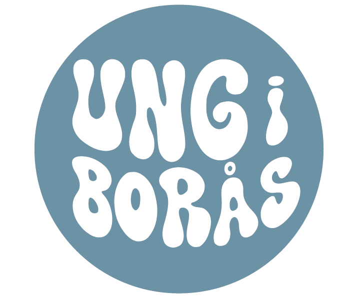
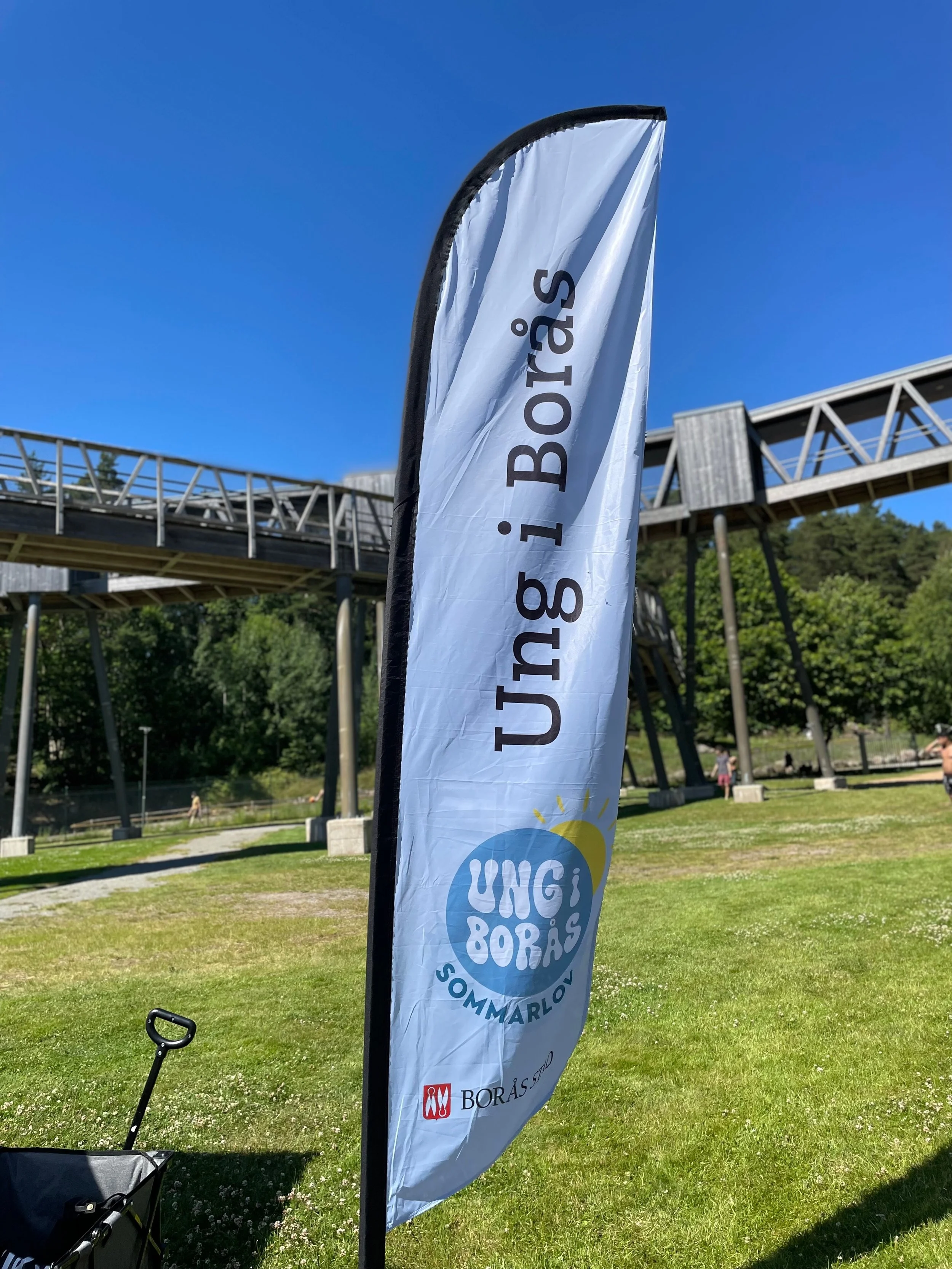
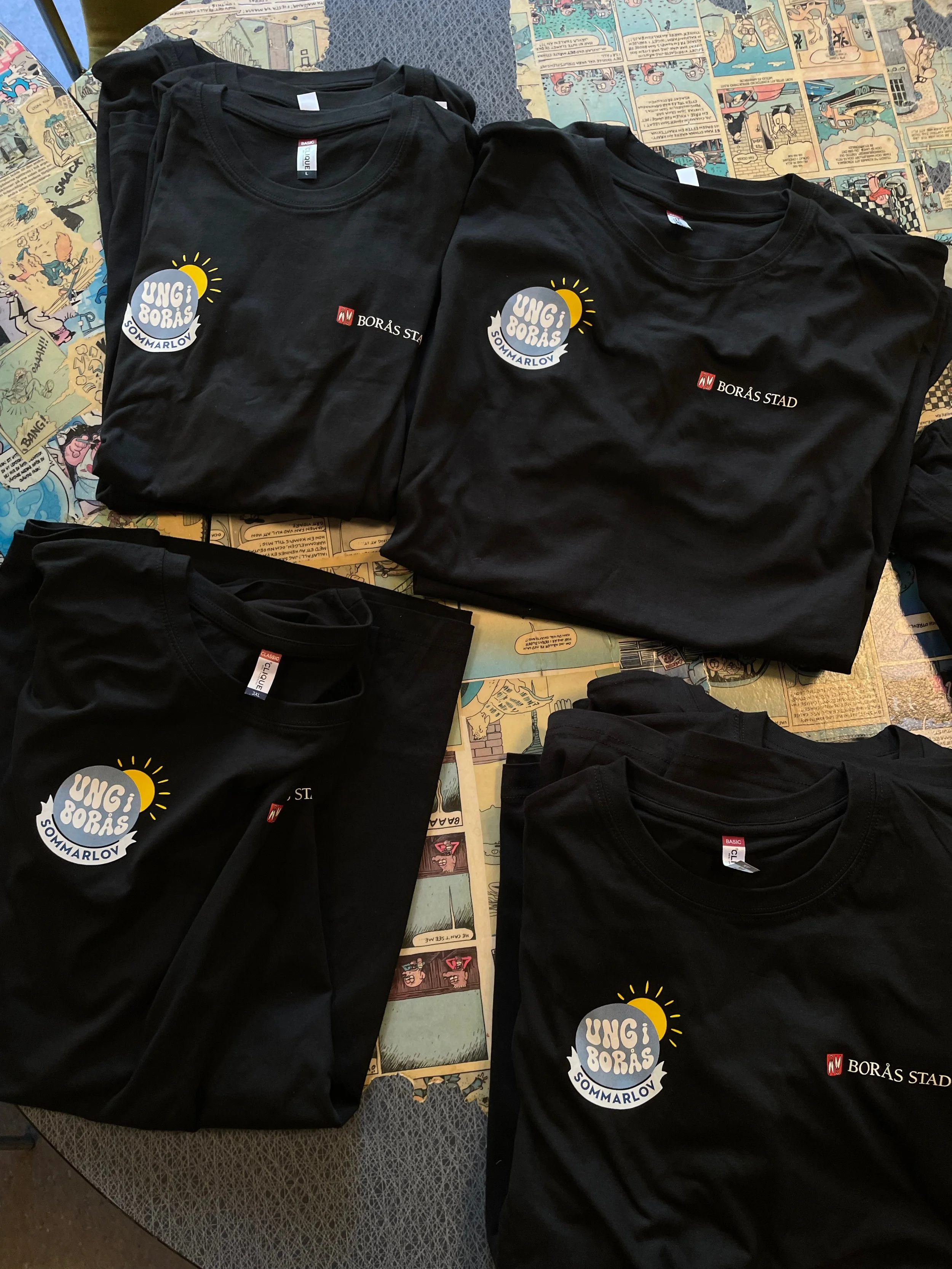
In this project, I was commissioned to create a logo for Ung i Borås, an open youth activity aimed at young people in the city of Borås. A central part of the process was youth influence – rather than designing on my own, I went directly to the target audience to understand what actually captures their attention.
Through conversations with the youth, we explored together what they respond to visually: which colours they are drawn to, which shapes feel relevant, and what communicates their identity and values. Their input formed the foundation for the design decisions I made.
At the same time, I worked within the framework of the City of Borås graphic profile, meaning that colour choices and visual language were adapted to follow the city's guidelines. The challenge – and the strength of the project – lay in balancing the wishes of the youth with the graphic ruleset, while still landing on something that feels alive and relevant to the target audience.
The result is a logo that is not only aesthetically considered – it was created with the target audience, not just for them.
HJÄLLBO PARKLEK
The logo's purpose is to be recognizable and playful - in its colors, shape, and placement. Therefore, both colors and font are vibrant but soft. Since it's a place for children, the communication should speak the same language and engagement.


EXAMINATION PROJECT
X
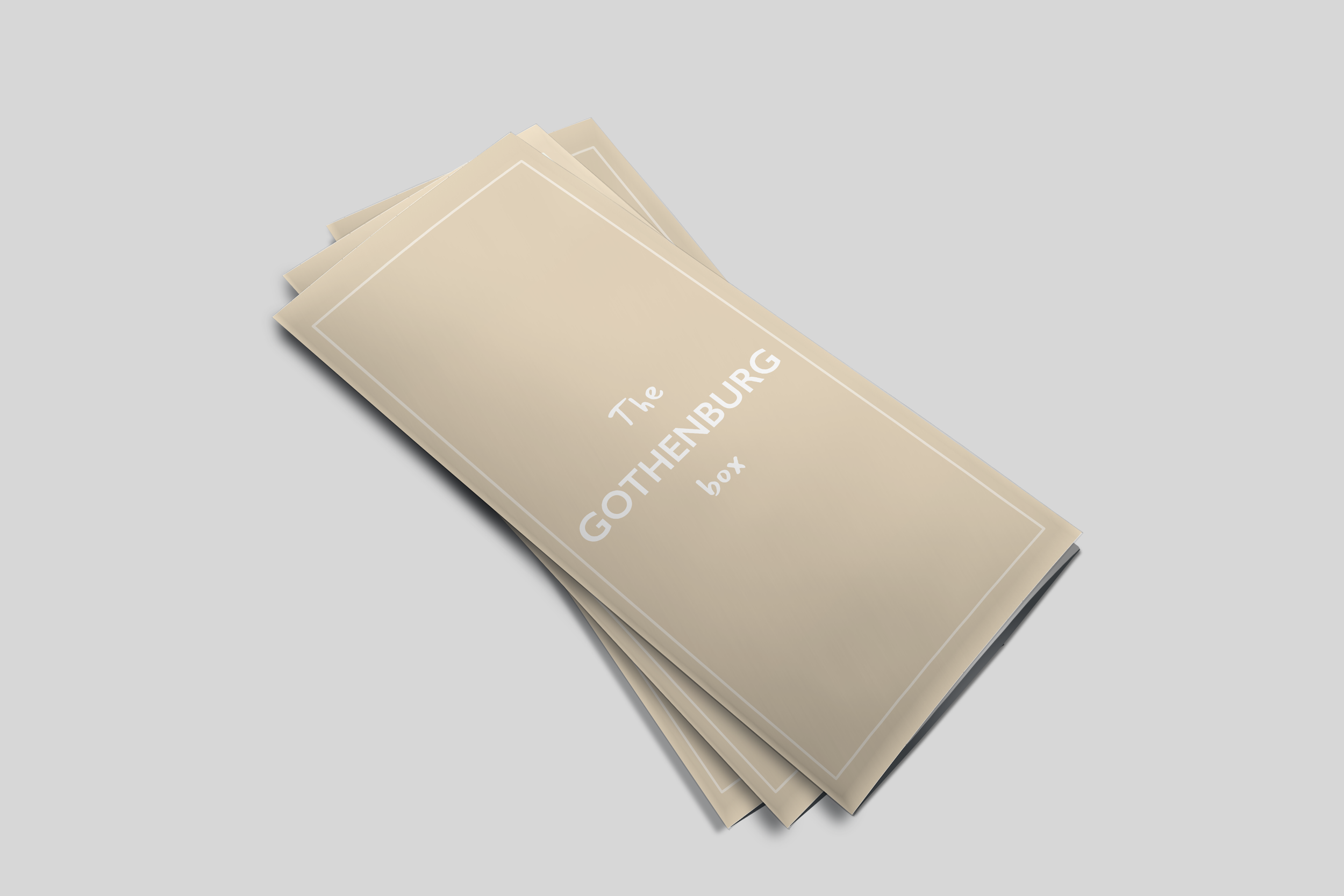
THE GOTHENBURG BOX
2021
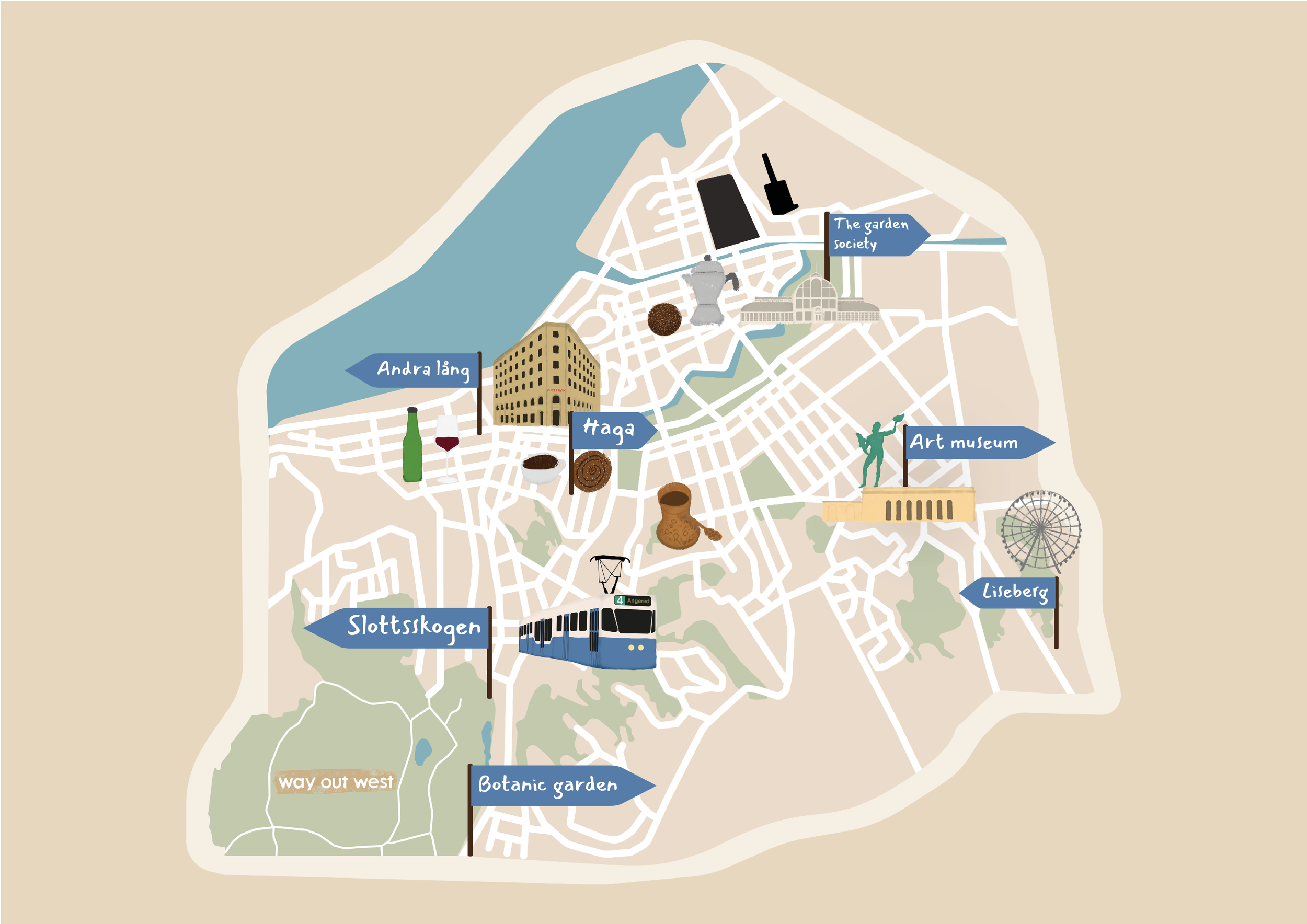
My examination project for graduation at Medieinstitutet Göteborg. I've made the whole project myself, including hand-drawn illustrations, also drawing the map.
Here I'm showing the result of the design.
JETSHOP X INTERNSHIP
Work for Jetshop from my digital designer internship 2020.
MOTION
Different short motion graphics.
School project about voting 2022. "Sweden is safer than ever", after a year of a lot of shootings including a shooting of a 12 year old.
School project together with Vilma Hultenius, Paul Nemorin and Tim Gustavsson.
Internal easter card for internship at Intraservice Göteborg stad.
WHOPS
School group project.

